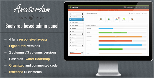
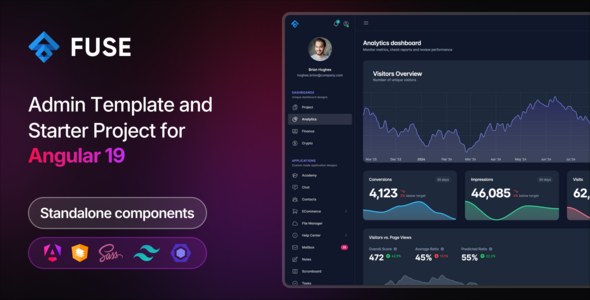
Amsterdam - Premium Responsive Admin Template
Amsterdam is a responsive Bootstrap-based admin template designed for backend panels, CMS systems, web apps, and hosting/control interfaces. It offers multiple layouts (dark and light), iPad/iPhone compatibility, a flexible 12-column grid, and a comprehensive set of UI components and plugins.
Product overview and compatibility
- Amsterdam admin template is a responsive template built with Twitter Bootstrap for backend panels, suitable for cms systems, web apps and other control/billing/hosting panels.
- Includes 4 main responsive layouts in dark and light versions. 2 of 4 layouts have 3 columns version.
- Amsterdam is fully compatible with iPad and iPhone devices.
- The template is based on 12 columns grid and is very flexible, keeping the main content part the same is very easy to change the general look and color theme.
- PSD files aren’t full, only 2 included – general ui components and dark colors layout, almost everything was designed in browser.
- Usual support available: Mon – Fri, 9:00 – 20:00 CET.
Key features
- 3 columns layout: 2 versions have 3 columns layout for wide screens.
- Advanced bootstrap components: Contains advanced modal and progress bar plugins.
- Error pages: Contains a bunch of error pages ready to use.
- Bootstrap icons: Font Awesome and Glyphicons included.
- 4 layouts: Unboxed dark responsive layout, Boxed light responsive layout, Unboxed light responsive layout, Dark/light color variations.
- Growl like notifications: Styled Growl like notifications.
- Main navigation: Dark and light navigation depending on layout color scheme.
- And much, much more…
Full features list
Layouts and columns
- Liquid
- 2 or 3 columns layout
- Light / Dark layouts
- 2 / 3 columns
- Boxed / Unboxed layout versions
Charts and data visualization
- Integrated Flot charts:
- Lines
- Pies
- Bars (vertical and horizontal with tooltips)
- Auto updating chart
- Threshold charts
- Filled charts
- Sidebar line chart and horizontal/vertical bars
Form elements
- Full set of input fields with default stylings.
- Appended, prepended elements
- Textareas options: counter and elastic
- Tags input
- Full set of HTML5 inputs
- Masked inputs
- iPhone like toggle switches
- Styled dropdowns: Uniform and Select2 plugins with options
- Styled and unstyled checkboxes and radios
- Stacked pills, stacked tabs
- Radio and checkbox buttons
- 2 directions form related buttons
- WYSIWYG editor
- Dual multiple selects with filter feature
- 4 forms versions: default (block), inline, transparent and horizontal
- 2 label positions for controls
- Fields validation
- Light and dark form elements for sidebar
- 3 types of wizards: with ajax submit, with standard submit, with validation
- Set of inputs grid
Components and navigation
- 5 types of middle navigation elements: usual buttons, buttons with background, pie charts, 2 types with Font Awesome icons
- jQuery sliders set
- jQuery UI datepickers: default with input field, inline liquid, inline fixed, icon trigger, dates range
- Color picker with options: HEX format, RGBa format, as a component
- Timepicker with options: with duration feature, 2 time formats
- Set of navbar elements: Collapsible widgets opened and closed by default, Progress bars, Input fields, Buttons in 2 positions and sizes, Toolbar tabs, Pager and pagination, Links list with dropdowns, Labels and badges, Glyphicons and Font Awesome icons (with or without dropdowns)
- Caret only dropdown
- Datepicker input
- Toggle checkbox, toggle radio
- Simple icons list
- Toolbar with smaller font size for heading
- Toolbar
- Navbar form elements
- Simple loader
- Some examples of custom usage of Bootstrap and jQuery UI elements
- Styled Growl like notification for success, warning, error and info messages
- Animated gif loaders
- Tooltip in 4 positions
Bootstrap components and UI kits
- Progress bars with options:
- Filled with text
- Starting with delay
- Unfilled
- With centered text inside
- With value
- With tooltip
- Horizontal and vertical
- Slim and wide
- 4 colors for success, info, warning, danger
- Left, right, top, bottom, navbar (left and right aligned), toolbar tabs with optional fade effect
- 4 sizes of pagination: left, center, right aligned
- Pager: boxed and unboxed
- Media lists and media objects
- 6 options for well element:
- Well large
- Well default
- Well small
- Well smoke
- Well white
- Nested wells with subtitles
- Breadcrumbs
- 2 navbars: light, dark with elements
- Scrollspy example
- Accordions and toggles
- Labels and badges
- Alerts in 4 colors: line notifications, block notifications, general top notifications
- Popovers in 4 directions
- Modals: Alert, confirm and prompt dialogs; Multiple dialogs; Programmatic close; Generic modal; Dynamic content; With iconified buttons; Override alert and confirm icons; Callbacks; Prompt with default value
- Buttons and icons: 8 default button colors; 5 button sizes: block with 100% width, large, default medium, small, mini; Vertical and horizontal button groups; Button dropdowns: top and bottom directions, split and standard; With icons: Font Awesome and Glyphicons
- Font Awesome and Glyphicon icons
- Basic and advanced thumbnails
- 12 columns responsive content grid with offset
Tables and data
- Tables:
- Default without side borders
- Striped table
- Bordered table
- Bordered table inside content
- Hover class
- Condensed table
- Transparent table
- Datatable
- Table with footer
- Table with gradient
- Table with checkboxes
- Table with toolbar
- Tabbed table
Error pages and typography
- Error pages:
- 403 error
- 404 error
- 405 error
- 500 error
- 503 error
- Website is offline
- Typography:
- Headings and default css stylings
- Syntax highlighter
- Left and right blockquotes
- Emphasys styles
- 8 default list styles
- Horizontal and vertical descriptions
File manipulations and changelog
- File manipulations:
- File manager
- Multiple file uploader with drag and drop functions
- Tabbed page
- Changelog
- Version 1.0 released
- Version 1.1 released
- Updated Bootstrap version
- Updated Sparklines plugin
- Added “Check all checkboxes” functionality to the table
The information on this website is sourced from the
ThemeForest product page
.