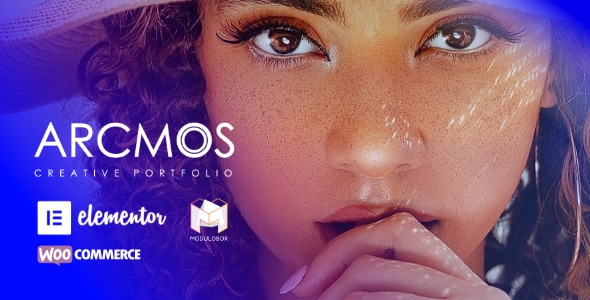
Arcmos - Creative Portfolio Theme for WordPress
Arcmos is a WordPress portfolio theme crafted for creatives, delivering fast, gallery‑centric layouts with lazy loading and deep integration with Elementor Pagebuilder and Gutenberg for flexible design.
Arcmos Core Design and Compatibility
Arcmos Portfolio WordPress theme is designed for creative websites with a minimalist yet attractive design approach, keeping your work in the center. It is powered by Elementor Pagebuilder, a live pagebuilder that lets you easily customize blocks, typography, fonts, colors, backgrounds, and more. The theme is Gutenberg optimized and also works with live pagebuilder on click.
The theme emphasizes large imagery to beautifully showcase photographs and includes built‑in sliders and gallery designs with different approaches. It is described as easy to build for first‑time WordPress users while delivering a professional and powerful feature set. Arcmos is supported and future proof, coded to high strict standards.
Portfolios
Arcmos provides a variety of grid based portfolio management designed to display work details efficiently. Portfolios can represent photography sets or other visual stories, with thumbnails that link to detailed views and lightboxes or slideshows for enlargement.
- Gallery of thumbnails representing photography occasions; on click, visitors see details with enlargements in lightboxes or slideshows.
- Portfolio posts can be organized within categories, which can be used as filters to refine gallery views.
- Multiple linking options: galleries can link thumbnails to custom links, off‑site destinations, or internal pages.
- Password protected individual portfolios.
- Album support and linkable albums for portfolio galleries.
- Layout flexibility: 1,2,3,4 and 5 column support; left sidebar, right sidebar, fullwidth page and Edge to edge page support.
- Filterable by portfolio categories to help visitors find specific work.
Linking Methods
- Custom Linked
- Direct Linked
- Lightbox Linked
Grid and Display Options
- Portrait grids, Landscape grids, Square grids, Masonry grids, Boxed grids, Spaced grids
- Classic grids with title, description and category
- Option to omit title, description or category name display
- Overlay and hover icon color customization; live previews for typography, fonts, and colors
- Responsive layout tweaks for various devices
Image Gallery Features
The Image Gallery features enable fast, scalable galleries with rich metadata and flexible layout options.
- Drag and drop images to build a gallery quickly
- Tag Supported: tag each image to generate filters from
- Title and description support for images
- 1,2,3,4 and 5 column support
- Left sidebar, right sidebar, fullwidth page and Edge to edge page support
- Filterable using tag categories
- Linking Method: Custom Linked, Purchase Linked, Download Galleries, Lightbox Linked
- Utilizes lazy loading for fast display of large galleries
- SEO with Alt text
- Portrait grids, Landscape grids, Square grids, Masonry grids, Boxed grids, Spaced grids
- Classic grids with title, description and category; option to omit title/description
- Overlay and hover icon color customization; live previews for typography and colors
- Responsive layout tweaks
Blog Lists and Grids
Arcmos supports rich blog layouts alongside its portfolio, enabling content variety and flexible presentation.
- Post formats: gallery, standard, aside, audio, quote, image and video
- Password protection for blog content
- Gutenberg optimized or build with live pagebuilder without affecting SEO
- Layout options: Left sidebar, right sidebar, fullwidth page and Edge to edge page support
- Utilizes lazy loading for fast page rendering
- Typography, font and color customization via live pagebuilder
- Tweak and adjust for responsive layouts
WooCommerce Integration
Arcmos is WooCommerce compatible, enabling selling of digital or physical products with integrated purchase flows.
- Sell digital or non‑digital products using the WordPress e‑commerce system
- Images in the theme can carry a purchase field linked to the corresponding product
- Lightbox supports viewing images with their purchase link accessible from anywhere on the site
Lightbox and Viewing Experience
Lightbox features provide a responsive, fast viewing experience with advanced navigation and preloading.
- Responsive; CSS‑only approach for resizing images and videos
- Touch and Drag: swipe navigation on touch devices and mouse drag on desktops
- Hardware‑Accelerated CSS3 transitions for faster animations
- Zoom & Fullscreen controls
- Smart preloading of slides as you view them
- Slideshow options: Carousel, 3D slideshow, 2D slideshow, column based carousels
- Lightbox enabled across gallery and portfolio views
- Before and After Images: easy to set up comparison views
Elementor Drag & Drop Live Editor
The Elementor integration provides the fastest, most intuitive editor in WordPress, enabling visual design without coding.
- Drag, drop and customize with no coding required
- Navigator: overview map of the page and drag‑and‑drop reordering
- Finder: a search bar for easy navigation between pages and dashboard settings
- Redo/Undo: quick reversal of edits
- Auto Save: continuous saving and backup
- Revision History: track and re‑trace page creation
- Draft Mode: save work as a draft while continuing edits
- Copy Paste: duplicate elements or move across pages
- Copy Style: copy entire styling from a widget, column or section
- In‑line Editing: edit content directly on screen
- Background Gradients and Background Videos for sections
- Background Overlay: add color, gradient or image overlay
- Enhanced Background Images: responsive image settings per device
- Shape Divider: decorative section separators
- Box Shadow: custom shadows without CSS code
- One‑Page Websites: click to scroll navigation with required sections
- Landing Pages: easy creation and management within WordPress
- Typography with Pagebuilder: customize font family, size, weight, transform, style, decoration, line‑height, letter spacing
- Google Fonts: access hundreds of fonts
- Text Editor Columns: responsive column layouts with adjustable gaps
- Layouts with Pagebuilder: flexible section and column controls
- Section Width and Section Height: finer control over section sizing
- Full Width and Stretch Section: create full‑bleed pages
- Column Width and Column Gap: precise column sizing and spacing
- Margin & Padding: control spacing around sections, columns and widgets
- Nested Columns: advanced layouts with columns inside columns
- Mobile Editing with Elementor: 100% responsive design tools for mobile
- Mobile Font Size: adjust font size per device
- Responsive Column Width: different column layouts on mobile
- Padding and Margin per device
- Reverse Columns: reorder columns for mobile layouts
The information on this website is sourced from the
ThemeForest product page
.