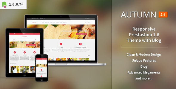
Autumn - Responsive Prestashop 1.6 Theme with Blog
This document outlines the theme’s features, module options, mobile behavior, and a roadmap for future updates. It covers general features, page-specific configurations, and planned enhancements with versioned notes.
All Modules
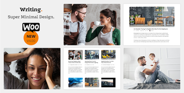
- Blog5 helper modules for blog
- Blog Categories
- Blog Archives
- Related Blog Posts
- Blog Custom Block A
- Blog Custom Block B
- Megamenu
- Image Slider
- Isotope Tabs
- Product Carousels
- Frontpage Blocks
- Manufacturers Carousel
- Ajax Search
- Social Links
- Product Share Buttons
- Facebook Block
- Custom Footer HTML Block
- Theme Customizer
Features
General Features
- Fluid Design
- Custom made css grid systemBased on default theme
- Zero core modifications
- Retina product image support
- Groupon style countdowns for product discounts
- Ability to change the entire color scheme of the theme including buttons and icons with one option
- Google Fonts option
- 3 different header designs
- Custom text area for header
- Ajax search with images
- Boxed and Fullwidth layout options
- Options for changing body and page backgrounds
- Custom mail templates
- Google Rich Snippets support
- Wordpress like Shortcodes system: Smartcodes. New Smartcodes will be added in future updates.
Category Pages
- Custom category headers
- Different combinations forbreadcrumb,category titleandproduct countpositions in category headers
- 2, 3, 4, 5 and 6 columns options for product grid view
- Auto adjusting grid system that suitable for various image size ratios; square, horizontal rectangle and vertical rectangle
- Option for hiding subcategories
- Options for removingstock information,available colors listandaverage ratingsfrom category view
- Quick image viewer for products to see all of the product images without getting into the product detail page
Product Pages
- Next / Previous product buttons
- Custom made, touch supported image zoom plugin
- Options for hiding certain informations from product pages such as
- Product Condition,Product Reference CodeandProduct Manufacturer Name
Footer
- 2, 3, 4, 5 and 6 columns options for footer areaCustom footer text area
Mobile Menu
- Mobile menu that activates below certain screen sizes
- Mobile menu will keep the Megamenu intact. Mobile users will see the exact same menu with the desktop usersShopping cart, login and signup forms and the entire my account page for logged in users will be in mobile menu for easy access
Planned Features
Please note, these features are currently planned features for future releases and they might or might not be added at once. All the features from this list will be eventually added to the theme but it will take some time and probably there will be some other updates between adding these features.
- Blog moduleAdded with Autumn 2.1 (24 May 2014)
- Custom mail templatesAdded with Autumn 2.2 (8 June 2014)
- Groupon style countdowns for productsAdded with Autumn 2.3 (24 June 2014)
- Retina (High-DPI) product imagesAdded with Autumn 2.3 (24 June 2014)
- Wordpress like Shortcodes systemAdded with Autumn 2.4 (08 July 2014)
- More customization options
The information on this website is sourced from the
ThemeForest product page
.