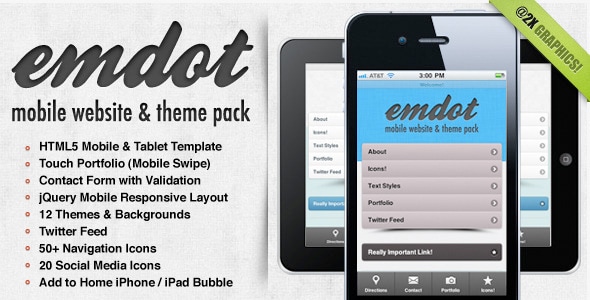
Emdot - Mobile Website & Template Pack
emdot is a responsive HTML5 template for mobile and tablet sites built on jQuery Mobile. It offers multiple themes, retina-ready graphics, and a feature-rich toolkit to accelerate mobile site development.
Foundation and development
Designed for rapid deployment, emdot leverages the jQuery Mobile framework to deliver a touch-friendly experience across devices. The template emphasizes easy setup and fast-launch capabilities, enabling you to stand up a mobile site quickly.
Its architecture focuses on clean, scalable HTML5 markup and a responsive layout that adapts to various screen sizes, ensuring a consistent user experience from phones to tablets.
Theming and branding
Emdot includes 12 Themes & Backgrounds, offering a ready-made visual foundation. You can either use the themes as-is or customize every aspect to align with your branding, ensuring a cohesive look and feel across all pages.
With straightforward branding controls, you can adjust colors, backgrounds, and typography to match your identity without compromising the template’s structure or performance.
Graphics and visual fidelity
@2X Graphics & CSS for HD Retina Displays provides sharp visuals on the latest high-density screens. The template also features a touch-optimized gallery to ensure photos look great when users are on the go, enhancing media presentation on mobile devices.
Key features
- jQuery Mobile
- Responsive Layout
- 12 Themes & Backgrounds
- Twitter Feed
- Contact Form with Validation
- 50+ Navigation Icons
- 20 Social Media Icons
- Portfolio with Mobile Swipe
- Add to Home iPhone / iPad Bubble
- @2X Graphics & CSS for HD Retina Displays
- Mobile Redirect Details
- Super easy to customize!
Social, interaction and content integration
The template integrates social and content features to enhance engagement and reach. It includes a built-in Twitter Feed and a library of icons for social sharing and navigation, enabling quick connection to external services and streamlined user actions.
Navigation and media are optimized for touch, with a portfolio section that supports mobile swipe gestures and a suite of icons to improve usability and visual appeal.
Mobile experience enhancements
Mobile Redirect Details provide control over device-based redirects, ensuring users land on the most appropriate version of the site. The popular Add to Home screen bubble for iPhone and iPad simplifies saving the site for quick access, boosting return visits and engagement.
The information on this website is sourced from the
ThemeForest product page
.