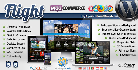
Flight - Responsive Fullscreen Background Theme
Flight is a responsive, retina-ready WordPress theme with a fullscreen background slideshow and a unique fly-out menu. It offers extensive customization options, WPML compatibility, eCommerce readiness, and a robust set of features designed for photographers, portfolios, and creative showcases.
Key Features
- Fully WooCommerce Compatible – easily add eCommerce functionality
- 100% WPML Multilingual Plugin Ready – fully tested and certified by WPML
- Custom Option Panel – includes a great option panel for simple customization
- Industry Exclusive Fly Out Menu – only theme available with this unique menu
- Menu Alignment – menu changes from left side to right side in seconds
- Fully Responsive Framework – tested on devices ranging 300px to 2560px
- Child Theme Included – includes fully functioning child theme for easy updates
- Automatic Updates – includes automatic updater for easy updates
- Compatible, Flexible & Versatile – with all major browsers and devices
- Vertically Responsive – not just horizontally responsive – menu resizes vertically
- Fullscreen Background Slideshow – 5 different background options
- Filtered Overlays – 16 different overlays to give backgrounds a filtered effect
- Video Backgrounds – optional built-in JW Player supporting video backgrounds
- Category Filterable Portfolio – smooth jQuery category sortable portfolio
- 50 Color Schemes – 50 uniquely designed color schemes for flexibility
- Custom Color Schemes – create your own uniquely designed color scheme
- Built-in Page Templates – simplify customization with pre-built page layouts
- W3C Validated & SEO Optimized HTML5 Code – 100% optimized coding
- Simple & Semantic – semantic classes, descriptive blocks, and hierarchy
- Easy to Customize – beautiful code indentation & commenting
- Dedicated Support Website – we are here to help with dedicated support
- Extensive Documentation – complete manual & step-by-step instruction guide
- Retina Display Support – ready to serve up high-resolution Apple images
- SEO Enhanced – proper implementation of new markup language & structure
- 8 Photoshop PSD’s Included – includes the actual source PSD files used
- Cyclone Slider – this image slider is fully responsive and easy to use
- Media Grid – easy to use filterable plugin with unlimited combinations
- prettyPhoto Lightbox – used for images, flash, YouTube, Vimeo, and iFrames
- Full Screen Google Maps API – Satellite & Roadmaps. Contact pages included
- Widgets – including Google maps, Flickr, Instagram, Twitter, MailChimp, & more
- Google Fonts – use fonts you find on Google’s API and use them on the fly
- Custom Shortcodes – extensive list of shortcodes with an easy to use generator
- Excellent Reviews – featured recently in an article by WPGlob Top Themes
Bonus and Licensing
- Includes a licensed copy of Media Grid – a $35 Value! – Create responsive and filterable portfolios with ease on your website. Media Grid comes with masonry layout, is designed to adapt each portfolio to any situation and is mobile optimized for responsive themes.
Click here for more details!
Media Grid and Visual Tools
- Cyclone Slider – fully responsive image slider
- Media Grid – filterable portfolio grid with unlimited combinations
- prettyPhoto Lightbox – lightbox for images, video, YouTube, Vimeo, and iFrames
- Full Screen Google Maps API – interactive maps with Satellite & Roadmaps
Support, Documentation and Updates
- Dedicated Support Website – we are here to help with dedicated support
- Extensive Documentation – complete manual & step-by-step instruction guide
- Automatic Updates – includes automatic updater for easy updates
- Child Theme Included – fully functioning child theme for easy updates
Design, Color and Typography
- 50 Color Schemes – 50 uniquely designed color schemes for flexibility
- Custom Color Schemes – create your own uniquely designed color scheme
- Google Fonts – use fonts you find on Google’s API and use them on the fly
Code Quality, SEO and Accessibility
- W3C Validated & SEO Optimized HTML5 Code – 100% optimized coding
- Simple & Semantic – semantic classes, descriptive blocks, and hierarchy
- SEO Enhanced – proper implementation of new markup language & structure
- Retina Display Support – ready to serve up high-resolution Apple images
Usage, Compatibility and Performance
- Fully Responsive Framework – tested on devices ranging 300px to 2560px
- Vertically Responsive – not just horizontally responsive – menu resizes vertically
- Video Backgrounds – optional built-in JW Player supporting video backgrounds
- Category Filterable Portfolio – smooth jQuery category sortable portfolio
- Full Screen Background Slideshow – 5 different background options
- Compatible, Flexible & Versatile – with all major browsers and devices
The information on this website is sourced from the
ThemeForest product page
.