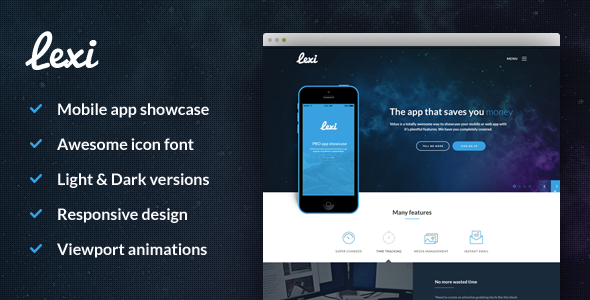
Lexi Mobile App HTML
Lexi is a modern, simple and responsive HTML template designed to showcase your mobile or web application with an inviting aesthetic that encourages users to explore its functionality and features.
What Lexi Is
Lexi provides a clean starting point for presenting apps, balancing a contemporary look with responsive behavior that adapts to various devices. The template emphasizes clarity, usability, and a visually engaging interface that guides visitors through core features.
Key features
- Includes Light/Dark PSDs
- Responsive design
- Animations
- Easy to customise
- Based on Bootstrap 3
Design and user experience
Lexi's modern aesthetic aims to entice users to explore the application's functionality and features. The combination of a clean layout, typography, and subtle motion contributes to a polished feel across devices while remaining accessible and fast.
Responsiveness and interaction
The template's responsive design ensures layouts adapt to different screen sizes, orientations, and device types. Animations add interactivity without overwhelming content, supporting a smooth and engaging user journey.
Customization and framework
Lexi is easy to customise, providing a flexible base you can tailor to your branding and content needs. It is Based on Bootstrap 3, offering a familiar grid system, components, and utilities to accelerate development.
The information on this website is sourced from the
ThemeForest product page
.