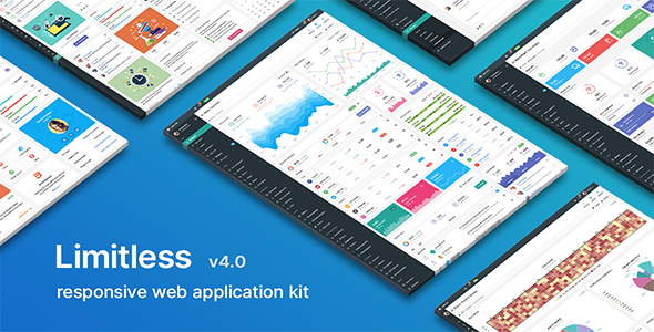
Limitless - Responsive Web Application Kit
Limitless is a responsive admin template and web application kit built on Bootstrap, offering 4 pre-built layouts, 1000+ commented HTML pages, 1000+ components, and 100+ plugins and extensions, all with a starter kit to accelerate development. It is fully responsive, LESS-based, and translation-ready for flexible multilingual apps.
Core capabilities at a glance
- Bootstrap-based framework designed for flexibility and extensive customization.
- 4 pre-built layouts: Main – dark sidebar and navbars, white page header and breadcrumbs line; Second – dark sidebar, light navbar, transparent page header and breadcrumbs line; Third – light sidebar, dark navbar, transparent page header (sidebar inside content area); Fourth – 2 navbars with horizontal multi-level navigation and a transparent page header.
- Starter kit: set of blank pages with basic functionality to speed up development.
- 1000+ commented HTML pages and 1000+ components with diverse features and options.
- 100+ plugins and extensions to cover data visualization, forms, editors, notifications, and more.
- Fully responsive design for optimal display on mobiles and tablets.
- LESS-based codebase with 100+ commented LESS files; normal and minified CSS compiled from LESS.
- Internationalization and translation readiness, including language switching, fallbacks, and detection.
Layouts and navigation
- Comprehensive navigation options: collapsible and accordion vertical navigation; multi-level horizontal navigation with state saving.
- Horizontal navigation used in navbars and mega menus; enhanced navbar with plugins and component support (forms, buttons, links, menus, progress bars, etc.).
- Mega menu supports customization of color, width, and content.
- Page and panel headers offer extensive customization; most components are optional and can be removed via LESS.
Layout options in detail
- Four pre-built layouts:
- Main – dark sidebar and navbars, white page header and breadcrumbs line.
- Second – dark sidebar, light navbar, transparent page header and breadcrumbs line component.
- Third – light sidebar, dark navbar, transparent page header; sidebar inside content area.
- Fourth – two navbars, horizontal multi-level navigation, transparent page header.
- Static, fixed, and mixed layouts with options for scrollbars, boxed and liquid width, and multiple sidebars.
Code, styling, and internationalization
- LESS-based development: 100+ commented LESS files, each corresponding to a single component, layout, page, plugin, or extension, enabling targeted edits.
- CSS: both normal and minified files compiled from LESS for production use.
- Translation readiness: language switching on-the-fly, fallback languages, language detection, and direct access to language resources.
- Extensive design system: harmonious, clean, and user-friendly interface with well-structured, commented code.
Form components and inputs
- Full set of basic form components; styled and native checkboxes/radios/file inputs, toggles and switches.
- Input groups in different sizes, colors, and components.
- Twitter Typeahead integration with Bloodhound engine for fast suggestions.
- Elastic textarea and masked inputs for enhanced input control.
- Password generator and password strength indicator.
- Character counter and limiter to manage input length.
- Form action buttons and tags inputs with Typeahead and copy/paste support.
- Dual multiple select boxes with single and multiple selections; editable form elements with enhanced component support.
- Form validation with comprehensive options.
Wizards, editors, and content editing
- Stepy wizard library for multi-step flows.
- Form wizard and Steps wizard for guided data entry.
- Summernote rich text editor; CKEditor for advanced editing; WYSIHTML5 editor for lightweight editing.
- Ace Code editor with 100+ modes, themes, and extensions for code-centric pages.
Pickers, date, time, and color
- Pickers for date and time (pick-a-date, pick-a-time, anytime, daterange) and jQuery UI pickers with options.
- Spectrum color picker with various options.
- Location and address pickers with Google Maps integration.
- Date paginator – date picker with calendar and pagination.
UI components and interaction tools
- Modal dialogs with enhanced options; dropdown menus with advanced styling; tabs and pills with customizable options.
- Collapsible and accordion components; advanced navigation with left/right placement and sizing options.
- Navbars and multi-navbar configurations; horizontal and vertical navigation variants.
- Buttons with styling options and loading spinners; tooltips and popovers; alerts with multiple display modes.
- Pagination and pager with styling and sizing; labels, badges, and progress bars in multiple styles and sizes.
- Page and component loaders with icon spinners; thumbnails with titles and descriptions; rich page headers and breadcrumbs.
- Media lists, jQuery UI and NoUI sliders with pips; language-appropriate syntax highlighting options.
- Affix and scrollspy components; dynamic tree views and context menus for rich navigation.
- Notifications: PNotify, Noty, and jGrowl styles for user feedback.
- Content panels with a full set of options; draggable and sortable panels for flexible layouts.
Layout, appearance, and content utilities
- 12-column responsive grid demonstrations to build complex page layouts.
- CSS3 animations via animate.min.css library for subtle motion effects.
- Icon sets: default Bootstrap Glyphicons, optional Icomoon and Font Awesome libraries.
- BlockUI for blocking elements during processing; image cropper with options for precise editing.
- Fullcalendar integration for calendar-based displays; comprehensive internationalization support.
- File uploaders including Plupload (multiple files) and Dropzone (single and multiple files); Bootstrap file input for single/multiple uploads.
- Sidebars: collapsible, hideable, left/right/dual, secondary, and sticky detached variations.
- Color and style options for sidebars (light/dark) and navigation; multi-sidebar configurations.
- Vertical and horizontal navigation adaptors; collapsible navigation with optional sizing and borders.
Data, tables, and dashboards
- Native data visualization with D3.js; ECharts, Dimple, and C3 libraries for diverse chart types.
- Google Charts and Google Maps integration for rich data presentation and location context.
- Vector maps for geospatial visualization; responsive data tables with basic and advanced options.
- DataTables with API usage, responsive behaviors, and extension options like scroller and fixed columns.
- Table utilities: sizing, borders, styling, and component-based table features; pagination-aware controls.
Media, content, and pages kit
- Media gallery with optional titles and descriptions; error pages (403, 404, 405, 500, 503) and offline page templates.
- Knowledgebase and FAQ pages; search pages kit (users, images, videos).
- Invoicing and task management pages; user cards and profiles with and without cover images.
- Knowledgebase, FAQ, and help content designed to be easily navigable and searchable.
Starter kit, support, and updates
- Starter kit designed for developers: blank pages with basic functionality to jump-start projects.
- Regular updates to keep the template current with Bootstrap and web standards.
- Fast and professional support with documented response times: Mon – Fri, 9:00 – 20:00 CET.
The information on this website is sourced from the
ThemeForest product page
.