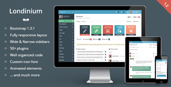
Londinium - responsive bootstrap 3 admin template
Londinium is a premium admin skin built on Bootstrap with a flexible content structure, 35+ plugins, and responsive layouts that work across devices. It features a 12-column grid, two sidebar options, both horizontal and vertical navigation, and extensive UI components powered by Bootstrap and jQuery plugins.
Architectural foundations and core capabilities
- Built on Bootstrap framework with compatibility for Bootstrap 3.1.1 and latest jQuery versions
- 2 columns liquid structure with 4 level navigation and 2 sidebar options
- Horizontal and vertical navigation structures to suit different admin workflows
- 12 columns grid for main content and widgets to support diverse data layouts
- Responsive template designed to work on mobile devices (e.g., iPhone, iPad)
- Integrated bootstrap plugins add easy-to-use components for buttons, dropdowns, and sizes
- Contains the most useful Bootstrap components and other jQuery plugins
- Supports 2 sidebar versions (wide and narrow) with left or right alignment
- Bootstrap default navbar menus extend horizontal navigation functionality
Layout options, navigation and visual design
- Static or fixed top navbar
- Top horizontal navigation with 4 level main navigation
- Menu collapse and disabled navigation items feature
- Flexible layout options for content blocks, grids, buttons and widgets
- CSS3 animation applied to links, buttons, dropdowns, tooltips, popovers, charts and more
- Custom Icomoon icon font included by default with 850+ icons on a 16px grid
UI components, widgets and visual interactions
- Integrated Flot charts for data visualization
- Page tabbed interface and animated form controls
- Animated styled checkboxes and radios; spinners with mousewheel support
- Checkbox toggles and date range picker with a custom layout
- Language switch menu and custom search dropdown with autocomplete
- Extensive set of styled basic tables and info blocks (charts, widgets, grid buttons)
- 850+ custom icon glyphs provided by the Icomoon font
Form components, inputs and validation
- Form components: basic inputs (text, password, placeholders, max value, predefined values, disabled/read-only)
- Three input sizes and rich form helpers (text/labels, hover and focus tooltips)
- Fields with left and right aligned icons and validation classes
- Group addons: icons, buttons, text, checkboxes, radios, dropdowns
- Elastic textareas with counters and tags input
- Animated checkboxes/radios with five color schemes
- Styled single file uploader and unstyled form components (selects, radios, checkboxes, file input)
- Spinner with mousewheel support; multiselect and single select
- Select2 dropdowns (with/without search) and multiple selects
- iOS-like Bootstrap toggles; masked inputs
- Listbox with filtering and advanced HTML5 inputs
- Form layouts: vertical, horizontal, bordered, separated, inside/outside panel
- 12 columns responsive inputs grid; WYSIWYG editor (inside panel, outside panel, inside modal)
- Form validation and multiple file uploader with drag-and-drop support
- Custom form snippets and extensive UI helpers
Tables, datatables and data presentation
- Advanced datatables across inside/outside panels, including bordered, striped, hover cells and condensed styles
- Datatable variants with tools menu, 2 types of pagination, and selectable rows
- Static tables in default, bordered, striped, condensed formats; inside and outside panels
- Custom table controls: labels, buttons, selects, button and icon groups, progress bars, multiselect, spinners
- Dynamic tables with responsive behavior and datatable enhancements
Interface components, widgets and interactions
- Modals: default, iconified, with form, with table, with remote path, with tabs, with WYSIWYG editor, large/small sizes
- jGrowl notifications and CSS3 animated loading spinners
- Themed progress bars and alert blocks; contextual backgrounds and text colors
- 4-direction tooltips and 4-direction popovers
- jQuery UI datepicker and sliders
- Bootstrap color picker and time picker
- Themed labels and badges; pagination in multiple sizes and alignments
- Pager options: boxed and unboxed; dropdown and dropup menus with two icon positions
- Tabs and pills in multiple configurations (default, justified, page tabs, toolbar tabs, iconified)
- Accordion and toggle groups; nav lists; stacked tabs and pills
Layout templates, skins and navigation patterns
- Template layouts include: Wide left sidebar (default), Wide right sidebar, Left narrow sidebar, Right narrow sidebar
- Wide sidebar variations: left aligned icons, collapsed by default, fixed navbar
- Horizontal navigation variants and horizontal navigation with sidebar
- Sidebar configurations with disabled navigation items
Team, users and support resources
- Task manager module: task grid, table with tasks, detailed task view with times, description, comments, and add-comment form
- User options: team page (boxed/unboxed layouts, custom user table)
- Contact list with chat layout and user table
- User profile page with activity, messages, user list, invoices, etc.
- Support pages: FAQ layout, chat with user lists and chat with contacts
Changelog and version history
Version 1.0 released
Version 1.1 released (March 25, 2014)
- Added: Boxed layout width fixed width
- Fixed: Right sidebar toggle issue
- Fixed: Sidebar overlap on small screens. Now it pushes content down
- Fixed: Narrow sidebar user menu image. Correct border radius
- Fixed: Fixed navbar sidebar issue. Sidebar appends to the navbar
Version 1.2 released (May 13, 2014)
- Added: Switch from wide sidebar to narrow sidebar
- Added: Offcanvas layout
- Added: Few more examples of new datatables plugin
- Updated: Main navigation accordion instead of toggle
- Updated: Datatables plugin to the latest version
- Updated: Minor visual changes
- Updated: Viewport to prevent scale on mobile devices
- Fixed: CSS issues (non-existing images, incorrect code)
Support and contact
- Usual support available: Mon – Fri, 9:00 – 20:00 CET
The information on this website is sourced from the
ThemeForest product page
.