Pannonia - fully responsive admin template
Pannonia is a premium admin skin built on Bootstrap with a flexible two-column layout, 3-level navigation, and an extensive set of UI widgets designed for responsive dashboards.
Overview
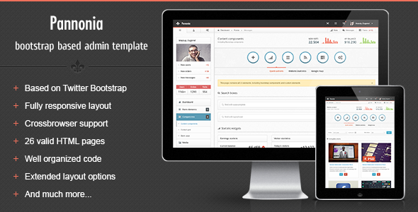
Pannonia – a new premium admin skin based on Twitter Bootstrap framework with flexible content structure. It has 2 columns liquid structure with 3 level navigation and lots of sidebar elements. Pannonia is compatible with Bootstrap 2.3.1 version. Integrated bootstrap plugins add an extra easy to use components to custom stuff like buttons, dropdown menus, different button sizes and many other. Pannonia is a fully responsive template, which means it is compatible with mobile devices such as iPhone and iPad, with ability to hide sidebar. 12 columns grid for main content and widgets makes the whole template very flexible for different type of data and content.
Key specs and layout
- Liquid 2 columns responsive layout
- 12 columns grid for main content and widgets
- 2 columns liquid structure with 3 level navigation
- Ability to hide/show sidebar and action tabs
- Compatible with Bootstrap 2.3.1
- Fully responsive template for mobile devices (iPhone, iPad)
- Integrated Flot charts and widget charts
Some features
- Hide/Show sidebar and action tabs — Just click on the button on top right nav to hide/show sidebar and action tabs panel
- Custom widgets — Custom widgets included
- Bootstrap components — All bootstrap components have custom styling
- Advanced modals — Advanced modals functionality
- Icons — 3 types of icons included: FamFam icons, Glyphicons and Font Awesome
- jQuery UI components — Some of jQuery UI components included
- Media elements — Layout for images/videos, with custom options bar
- Navbar elements — Lots of navbar elements
- Sidebar elements — Lots of sidebar widgets
- Full features list — Comprehensive set of UI components and utilities
Bootstrap components and UI integration
- Bootstrap components — All bootstrap components have custom styling
- Advanced modals — Enhanced modal dialogs
- Icons — FamFam icons, Glyphicons, Font Awesome
- jQuery UI components — Included components for enhanced interactions
- WYSIWYG editor — CKEditor integration
- Dual multiple selects with filter feature
- HTML5 inputs — Full set of inputs
- Masked inputs and styled dropdowns (Uniform and Select2)
- Radio and checkbox controls — Styled and unstyled variations
- Form control layouts — Block, inline, and horizontal
- Validation — Fields validation
- Form wizards — 3 versions: default (block), inline, and horizontal
Widgets and charts
- Collapsible action tabs with buttons and statistics
- jQuery sliders
- jQuery UI datepickers — default, inline liquid, inline fixed, icon trigger, date ranges
- Color picker — HEX and RGBA formats
- Timepicker — with duration feature and multiple formats
- Charts — Integrated Flot charts: lines, bars (vertical and horizontal with tooltips), pies, auto updating chart
- Widgets with charts
- Calendar with schedule
Navigation, controls and UI elements
- Collapsible widgets — opened and closed by default
- Progress bars, input fields, buttons
- Toolbar tabs, pager and pagination
- Links lists with dropdowns, labels and badges
- Glyphicons, FamFam and Font Awesome icons — icon-only or icon lists with dropdowns
- Caret-only dropdown
- Datepicker input, checkboxes, radios
- Simple icons list, toolbar, navbar form elements
- Simple loader and Growl-like notifications (success, warning, error, info)
- Animated GIF loaders
- Tooltip in 4 positions
Bootstrap components and layouts (additional)
- Progress bars — various options including left, right, top, bottom placements
- Navbar with left/right alignment and optional fade
- 4 sizes pagination — left, center, right aligned
- Pager — boxed and unboxed
- Well elements — large, default, small, smoke, white, plus nested wells with subtitles
- Breadcrumbs, Scrollspy
- Accordions and toggles
- Alerts — in 4 colors: line notifications, block notifications, general top notifications
- Popovers in 4 directions
- Modals — alert, confirm, prompt dialogs; multiple dialogs; programmatic close; dynamic content
Tables, grids and data presentation
- Tables — default, striped, bordered, bordered inside content, hover, condensed
- Datatable with advanced features
- Table with footer, gradient, and checkboxes
- Table with toolbar and tabbed variants
Typography and content styles
- Headings and default CSS stylings
- Syntax highlighter
- Blockquotes (left and right)
- Emphasis styles
- List styles — 8 default styles
- Description lists (horizontal and vertical)
File manipulations and media
- File manager
- Multiple file uploader with drag and drop
- Page with media elements
Changelog
- Version 1.0 released
- Version 1.0.1 released
- Fixed checkboxes issue which didn’t work inside table
- Fixed word wrapping issue in footer and breadcrumb links
Credits
- Demo images by FreebiesBug
The information on this website is sourced from the
ThemeForest product page
.