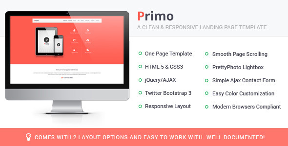
Primo Responsive Landing Page Template
Primo Responsive Landing Page Template is a marketing-focused solution for promoting your app on Android and iOS, with an easy-to-customize, responsive layout suitable for any app category.
Main Features
- One Page Template
- 2 Layout Options
- Parallax and Non-Parallax version provided
- HTML 5 & CSS3
- Responsive Layout
- Twitter Bootstrap 3 Framework
- Smooth Page Scrolling
- CSS3 Effects
- PrettyPhoto Lightbox
- Simple Ajax Contact Form
- Extremely Easy Color Customization
- Total 5 Color schemes provided
- Modern Browsers Compliant
- Easy to Work with.
- PSDs Provided.
What you are getting?
- Detailed Documentation
- html, js and css files for Both Layout Styles/Options (5 Color Schemes)
- PSDs for both layout styles
Source & Credits
- Thanks so much to
- Twitter Bootstrap 3
- jQuery By jQuery Foundation, Inc.
- Pixel Perfect Icons By: FontAwesome
- Free Font: Open sans & ASAP
- PrettyPhoto Lightbox Plugin by
STÉPHANE CARON
- App Screenshots By: LEXNAU
- Images by Unsplash
- Smart Phone & Tablet
Image By: Pixeden
Note: Images in Preview are not included in the download file and content animation (from left and right) in parallax version not supported in mobile and tablet devices.
Update history
-
Version 1.0.2 – 24 November 2014
- Spam Protection
- Working Subscribe form
-
Version 1.0.1 – 18 December 2013
- Parallax versions added in both layout options
- Contact form added in second layout option
-
Version 1.0.0 – 13 December 2013
The information on this website is sourced from the
ThemeForest product page
.